
How To Create A Mobile Responsive Website Layout For Small Local Service Businesses ?
The United States is home to millions of small local service businesses that work hard every day to reach their communities. From plumbers and electricians to cleaning services and local repair shops, these businesses depend on online visibility to attract new customers. In today’s digital world, people in the USA often search for services from their mobile phones before making a call or booking an appointment. This shift has made mobile responsiveness one of the most important parts of modern web design. A website that looks good and works smoothly on a smartphone can build trust, improve user experience, and help a local business stand out in a competitive market.
Many small business owners know they need a website but struggle to understand how to make it mobile friendly. Good design does not need to be complex or expensive. It simply needs to focus on clear content, fast loading time, and layouts that adapt to small screens. When done correctly, a mobile responsive website can help a local service business connect with nearby customers, share important information, and boost overall growth. This blog explains how to create such a layout step by step, using simple guidance that anyone can follow.
How To Create A Mobile Responsive Website Layout For Small Local Service Businesses
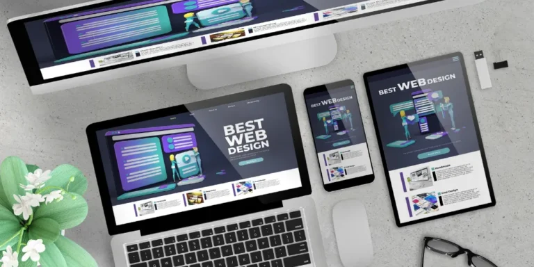
Mobile responsive website design helps small service businesses in the USA reach customers who browse using their smartphones. It ensures that every page adjusts smoothly to small screens without losing clarity or function. This makes the website easier to read, more engaging, and more effective in converting visitors into customers.
1. Understanding What Mobile Responsiveness Really Means
Mobile responsiveness means creating a website layout that adjusts itself to all screen sizes without breaking or becoming hard to read. A mobile responsive site works smoothly on smartphones, tablets, laptops, and large monitors. For small local service businesses, this is especially important because most customers now use mobile phones to find plumbers, electricians, cleaners, or repair services. A good responsive design ensures that text remains readable, buttons are easy to tap, and images resize without losing quality. It also ensures fast loading times since mobile users often depend on mobile data. The main goal is to provide a smooth experience that keeps visitors from leaving too quickly. When people can easily navigate your website, they are more likely to call your business or fill out your contact form. Responsive design also improves search engine ranking because Google gives preference to mobile-friendly websites. This means more people in the USA searching for your services can find you quickly. Understanding this concept helps small businesses build a strong online presence that brings real results.
2. Choosing a Simple and Clean Layout
A simple and clean layout helps users find what they need quickly. Most mobile visitors prefer websites that show clear information without clutter. Small local service businesses should focus on layouts that highlight key services, location, contact number, and working hours. A clean layout usually has plenty of white space, which helps the page feel open and easy to read. This reduces user confusion and increases trust. On a mobile screen, unnecessary elements like large banners, too many animations, or long paragraphs can feel overwhelming. Clean layouts load faster, which helps keep visitors from leaving. For businesses in the USA, where customers move fast and want instant results, simplicity is key. A simple layout also makes it easier to guide visitors toward important actions like calling your number, booking a service, or checking your reviews. When the layout is uncluttered, each element has room to stand out. This leads to better user engagement and stronger conversions.
3. Using Flexible Grids and Responsive Columns
Flexible grids help your website adjust to different screen sizes. Instead of fixed-width layouts, responsive grids use percentage-based widths so elements shrink or grow based on the device. For example, a three-column section on a desktop may automatically switch to a single column on a mobile phone. This makes the website easier to read and scroll through. Many website builders and frameworks offer built-in responsive grids, which make the design process easier. Small service businesses can use these grids to organize service descriptions, pricing details, and contact information neatly. A flexible grid ensures that images, text blocks, and buttons never overlap or become unreadable on small screens. Without this system, your site may appear broken or messy on mobile devices. People in the USA expect a smooth experience when browsing local services. Using responsive columns ensures your site maintains a professional look on all devices, encouraging visitors to trust your business.
4. Creating Tap-Friendly Buttons and Links
On mobile devices, users interact by tapping, not clicking. This means your website must have large, easy-to-tap buttons that work even for users with larger fingers. Buttons should have enough spacing around them so that people do not accidentally tap the wrong link. Important actions—like “Call Now,” “Book Service,” or “Get a Free Quote”—should be placed prominently where users can find them quickly. Tap-friendly design improves usability and reduces frustration. Many small service businesses lose potential customers because their buttons are too small or too close together. When designing for mobile, think about the user’s hand movements, not just the look of the page. A button should be easy to tap with one hand, especially since many mobile users scroll with their thumb. Tap-friendly elements also help improve accessibility for older adults, who may struggle with tiny buttons. When your website is easy to use, visitors are more likely to take action and contact your business.
5. Adding Clear and Readable Text
(30 lines)
Readable text is essential for a mobile responsive website. Because mobile screens are small, text must be large enough to read without zooming. A good rule is to use a simple font with a minimum size that remains clear on small screens. Avoid using fancy fonts that are hard to understand. Small service businesses should use short paragraphs and bullets to make information easy to scan. Many mobile users skim pages rather than reading long blocks of text. Clear headings help guide them to the information they want, such as service details, pricing, or contact information. Maintaining strong contrast between text and background improves readability for all users. Dark text on a light background is usually the easiest to read. When customers can read your content easily, they are more likely to stay on your website and learn more about your services. Readability builds trust and helps visitors feel confident in choosing your business.
6. Using High-Quality but Optimized Images
Images play a big role in making your website visually appealing, but they must be optimized for mobile. Large images take longer to load, especially on slower networks. This can cause visitors to leave before the page finishes loading. Optimized images use smaller file sizes without losing quality. Tools and website builders often compress images automatically. Small service businesses can use images of their work, their team, or their tools to help customers feel connected. However, images should not stretch or become blurry on smaller screens. Responsive design automatically resizes images so they fit neatly within the screen width. This prevents issues such as images overflowing outside the layout. Proper alt text also helps search engines understand the content. Good images make your website feel professional, trustworthy, and engaging for mobile visitors across the USA.
7. Prioritizing Fast Loading Speed
Speed is one of the most important parts of mobile responsiveness. A slow website can cause potential customers to leave within seconds. Mobile users expect webpages to load quickly, even on unstable connections. Small service businesses must reduce unnecessary elements such as oversized images, unused scripts, or heavy animations. Using caching, compressed images, and clean code can dramatically improve loading speed. Google considers speed an important ranking factor, so faster sites are more likely to appear at the top of search results. Fast websites give users a smooth experience, reduce frustration, and increase engagement. If your site loads quickly, visitors can easily browse your services, read your information, and contact you. In the USA, where customers often compare businesses online, speed can give your website a competitive advantage. A fast website supports your overall growth by helping you capture more leads and keep visitors satisfied.
8. Organizing Information for Quick Access
(30 lines)
Mobile visitors want information quickly. They do not want to scroll endlessly to find your phone number or service details. A good mobile responsive design organizes information in a way that guides users naturally. This includes placing the most important information at the top of the page. For example, your service categories, location, and contact button should appear early. Using collapsible sections allows small screens to display a lot of information without overwhelming users. A clean navigation menu also helps mobile users jump to key pages. When information is organized clearly, visitors can easily understand what your business offers. This increases their confidence and encourages them to take action. Local service businesses in the USA serve busy communities, so providing quick access to information can lead to higher customer satisfaction and more conversions.
9. Adding a Strong Call to Action (CTA)
A call to action guides users toward the next step. Mobile responsive websites should feature clear CTAs placed in visible locations. “Call Now,” “Book Appointment,” or “Request a Quote” are examples of useful CTAs for small service businesses. These buttons should stand out through color or placement so visitors can easily notice them. A strong CTA increases conversions by encouraging users to contact your business. On mobile screens, CTAs should be large, easy to tap, and repeated throughout the page. Some visitors may scroll quickly, so having multiple CTAs ensures they always have access to your services. When CTAs are clear and direct, they eliminate confusion and lead to more customer interactions. A strong CTA is one of the most powerful tools for growing a local business’s online presence.
10. Testing the Website on Different Devices
Testing is a crucial step in building a mobile responsive website. It ensures the design works smoothly on smartphones, tablets, laptops, and larger screens. Many small business owners forget this step, causing issues where pages look good on one device but broken on another. Testing involves checking the layout, text, images, buttons, and overall functionality. This ensures visitors have a consistent experience. Tools like responsive simulators or real devices help designers identify problems early. Testing also helps catch mistakes such as overlapping text, hidden elements, or slow-loading pages. For small service businesses in the USA, thorough testing ensures the website feels professional and trustworthy. Customers will stay longer, browse more pages, and feel confident contacting your business. A well-tested site gives your brand a strong digital presence, helping you compete effectively in the local market.
Conclusion
A mobile responsive website is essential for every small local service business in the USA. It helps businesses reach customers who rely on their phones to find services quickly. A well-designed site improves user experience, builds trust, and increases the chances of converting visitors into loyal customers. By using simple layouts, readable text, optimized images, and fast loading speeds, businesses can create a site that works smoothly on all devices.
Organizing information clearly and adding strong calls to action further improves engagement. Testing ensures that everything looks and functions correctly across different screen sizes. When businesses invest time in creating a responsive website, they open the door to more opportunities and better customer relationships. In today’s digital era, a mobile responsive website is not just a trend—it is a basic requirement. By following the steps and insights in this guide, small service businesses can build a strong online presence and grow successfully within their local communities.